
The Sahel palette: composing an interior that does not overheat the eye
Sand beige, deep black, olive green: the anatomy of a palette that works under very hard light.
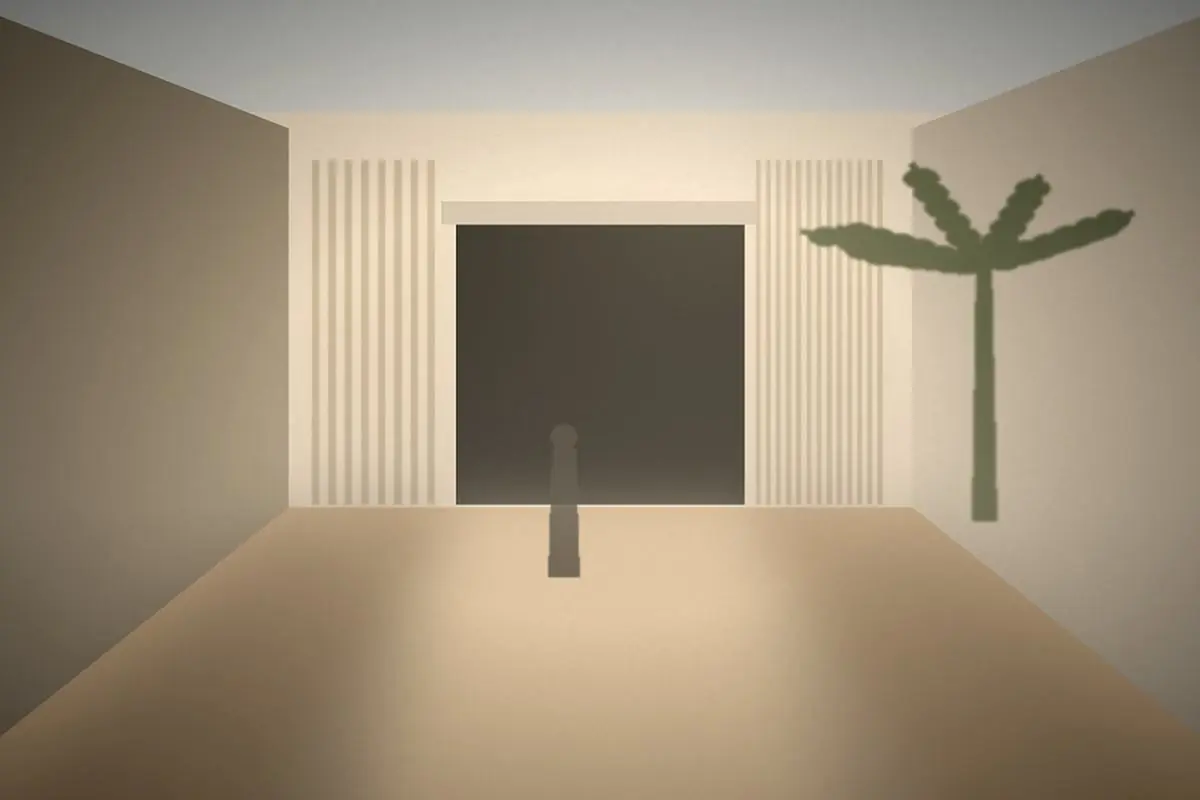
Under Sahelian light, pure white becomes blinding. Cool grey becomes dirty. Palettes designed for European interiors collapse at 2,000 lux.
Three simple rules
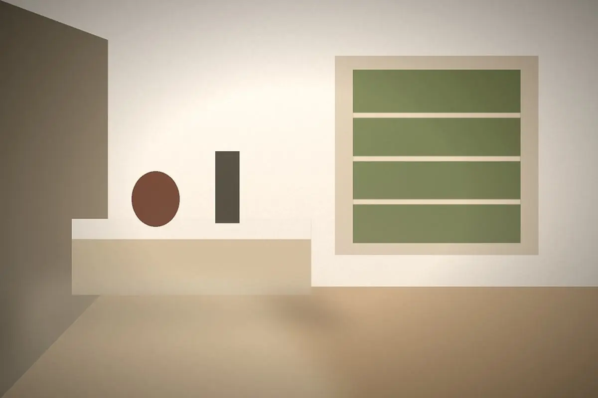
1. Bring the white down. Replace pure white with a warm cream (around 5% yellow). The eye rests, and the room loses nothing in brightness.
2. One black, not several. Matte black is the best ally of very bright interiors: it structures without absorbing visual heat. One black, varied through texture.
3. A plant-based accent. Olive green works because it is already outside, in the neems and acacias. It brings the landscape in.
What to avoid
- Cool blues, which turn dull grey as soon as light drops.
- Large quantities of glossy surfaces: they bounce back light that is already too strong.
- Full-terracotta schemes, which tire the eye within six months.
Materials matter more than colours
A waxed-plaster cream, a cotton-canvas cream and a smoothed-earth cream are not the same colour. Under this light, texture accounts for 60% of the result. That is why we systematically work with full-scale samples, placed on site and observed at three moments of the day.
Comments
Be the first to respond.